Brand Elements
Orange Top Bar
The orange bar reinforces consistency and cohesion across our brand system. Rooted in our orange heritage, it serves as a subtle yet recognizable detail that strengthens brand identity without overwhelming layouts.
Used thoughtfully, the bar appears clean and intentional—positioned along the top edge and extending to the full bleed of the page. Its consistent placement helps unify materials across touchpoints, from digital to print.
p:has(.mb-ovenp5j){margin-bottom:42px!important;}Rather than acting as a dominant visual, the orange bar functions as an accent. It supports the overall composition, adding structure and familiarity while allowing primary content to remain the focus.

Rounded and Square Corners
Using a mix of square and rounded corners in image frames and text containers is a subtle but powerful move in our brand. It creates contrast, personality, and recognizability without needing loud visuals.
Square corners communicate structure, precision, and professionalism while rounded corners add friendliness, approachability, and a modern look and feel.
We use 3 sharp corners and 1 rounded. The corner radius scale should be 8px, 16px, 24px.

The Arrow
The Arrow suggests movement and momentum. It symbolize how we are a guide for customers toward a solution, goal, or better outcome. It communicates moving forward, which aligns with ideas like progress, growth, innovation, and improvement.
This arrow is an important part of the visual language of the brand. We use it in the website, presentation slides, marketing materials, posters and ads.
The arrow is taken from the negative space within our logo, representing our brand as a distillation of our highest level symbol.
p:has(.mb-0xlgmfb){margin-bottom:60px!important;}In marketing, advertising, and digital experiences collateral like social media graphics, ads, infographics, and headlines on our website, we use the arrow to lead the viewer’s eye, highlighting key information and emphasizing calls to action.

All Elements Combined
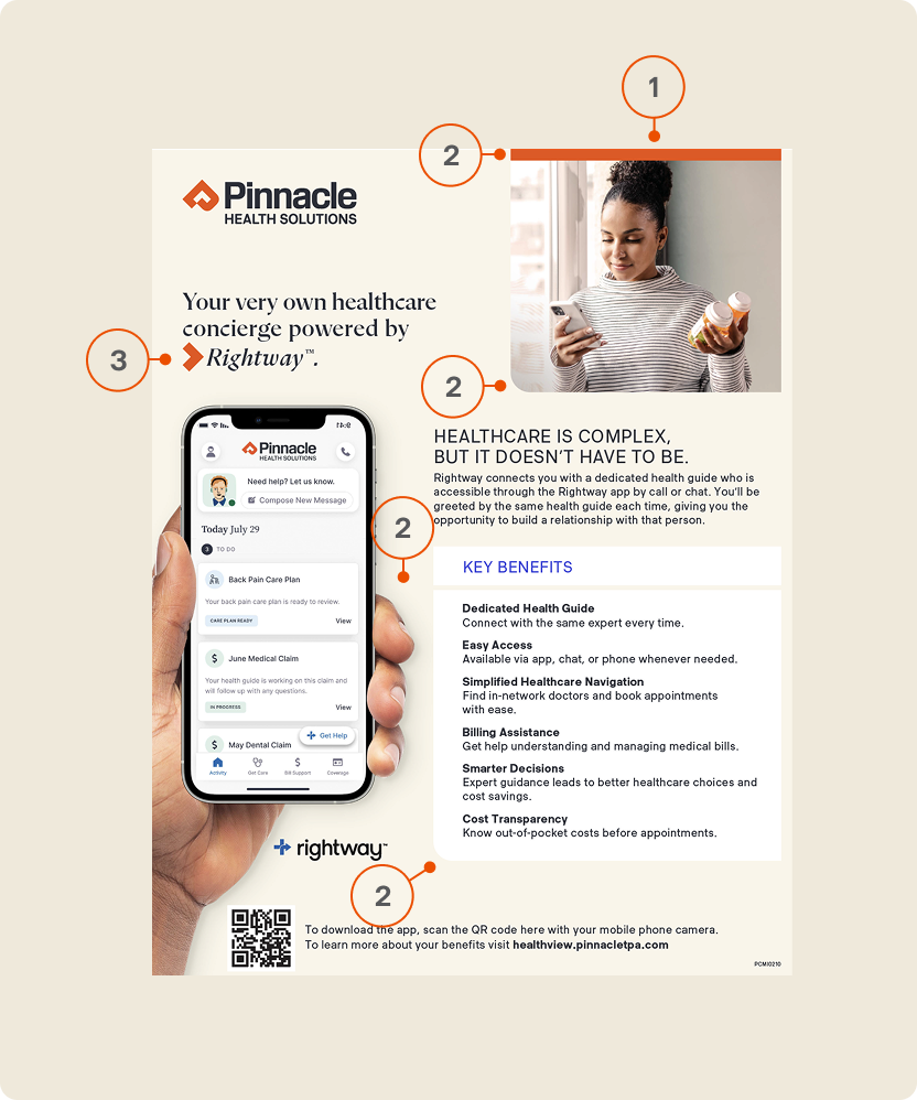
This provided example combines the orange bar, directional arrow, and mixed corner radii feels cohesive and purposeful—where the bar anchors the composition, the arrow guides attention to key messaging, and the interplay of sharp and rounded corners adds both structure and approachability. Together, these elements create a balanced visual system that is clear, recognizable, and intuitively directs the user experience.
1- Orange Top Bar
2- Rounded and Sharp Corners
3- The Arrow