

Our Logos
p:has(.mb-yswv09m){margin-bottom:3em!important;}This new Pinnacle Health Solutions logo brings the brand strategy to life by expressing its core themes of trust, independence, human-centered service, and forward momentum. The geometric mark, formed from a stylized “P,” an upward arrow in the negative space, and a subtle mountain abstraction, creates a strong, ascending shape that conveys competence, structure, and progress. It visually reinforces Pinnacle’s role as a reliable, future-focused partner poised for national growth.
p:has(.mb-ucwq335){margin-bottom:1em!important;}.tsm-v6hzy9{font-weight: 500}Logo Structure
p:has(.mb-32q6fwy){margin-bottom:8px!important;}Our logo mixes rounded and angular elements to evoke a modern, yet natural feeling. We paid careful attention to creating consistent spacing and alignment throughout to communicate care, professionalism, and deliberate thought.
.imgw-kty3bmp{max-width:100%;width:100%;}@media(min-width:768px){.imgw-kty3bmp{max-width:710px;}}@media(min-width:1024px){.imgw-kty3bmp{max-width:710px;}}.imgm-gb3mcbo{margin-bottom:54px}@media(min-width:768px){.imgm-gb3mcbo{margin-bottom:30px}}@media(min-width:1024px){.imgm-gb3mcbo{margin-bottom:30px}}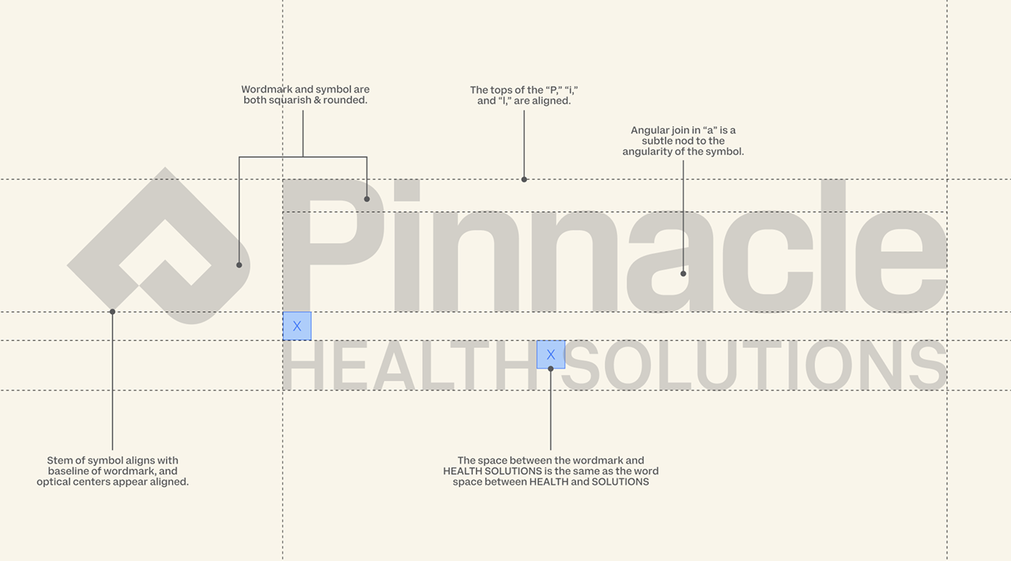
p:has(.mb-eyerdkl){margin-bottom:1em!important;}Primary Logo
The primary logo is your “default” mark—the face of our brand, the one people should see most often. The primary logo should be used in website headers/homepage, marketing materials, official documents, signage & large-format uses, press and partnerships.
.imgw-4zv4ruk{max-width:315px;width:100%;margin-left:auto;margin-right:auto;display:block;}@media(min-width:768px){.imgw-4zv4ruk{max-width:618px;}}@media(min-width:1024px){.imgw-4zv4ruk{max-width:618px;}}.imgm-mx18get{margin-top:32px;margin-bottom:52px}@media(min-width:768px){.imgm-mx18get{margin-top:52px;margin-bottom:52px}}@media(min-width:1024px){.imgm-mx18get{margin-top:52px;margin-bottom:52px}}
p:has(.mb-zidahif){margin-bottom:1em!important;}.tsm-wqco38{font-weight: 500}Secondary Logo
While the primary Pinnacle logo is the main brand identifier, the secondary logo adds flexibility, consistency, and depth to the visual identity. The secondary logo is used when the primary logo doesn’t fit well functionally, visually, or spatially in a specific context. Note: The secondary logo should only be used with approval from our marketing team for special cases.
.imgw-19ympb2{max-width:300px;width:100%;margin-left:auto;margin-right:auto;display:block;}@media(min-width:768px){.imgw-19ympb2{max-width:370px;}}@media(min-width:1024px){.imgw-19ympb2{max-width:370px;}}.imgm-n8mbcjv{margin-top:54px;margin-bottom:46px}@media(min-width:768px){.imgm-n8mbcjv{margin-top:54px;margin-bottom:54px}}@media(min-width:1024px){.imgm-n8mbcjv{margin-top:54px;margin-bottom:54px}}
p:has(.mb-tulsmib){margin-bottom:1em!important;}.tsm-xddwmf{font-weight: 500}Brand Mark
The usage of the brand mark is highly adaptable and can be used for: social media profile pictures, app icons, favicons, packaging, merchandise, watermarks, and small-scale print. Unlike a full logo lockup, the brand mark stays clear and recognizable even at very small sizes.
.imgw-bj1kaxx{max-width:170px;width:100%;margin-left:auto;margin-right:auto;display:block;}@media(min-width:768px){.imgw-bj1kaxx{max-width:170px;}}@media(min-width:1024px){.imgw-bj1kaxx{max-width:170px;}}.imgm-ygjzhf7{margin-top:32px}@media(min-width:768px){.imgm-ygjzhf7{margin-top:50px}}@media(min-width:1024px){.imgm-ygjzhf7{margin-top:50px}}
.tsm-yv27ye{font-weight: 500}Logo Color Identification
The approved logo colors should remain consistent across all applications. Do not reproduce the logo in any colors other than the following approved colors. The full-color logo should only be used over a white background or the approved light cream color. The reversed knock-out logo (white text) should only be used over the approved primary colors.




.tsm-18cqu15{font-weight: 500}Logo Clear Space
Clear space around the Pinnacle logo ensures legibility and visual impact. This area should be free of other elements, such as type and imagery. Minimum clear space is an area equal the dimension of the mark on all four sides. The ideal size for the logo on print materials is 1 inch square. The logo should never be used at a width smaller than 1.75 inches. Any application smaller than that width needs approval from Marketing.
.imgw-8raj893{max-width:100%;width:100%;}@media(min-width:768px){.imgw-8raj893{max-width:100%;}}@media(min-width:1024px){.imgw-8raj893{max-width:100%;}}.imgm-4a05slk{margin-bottom:60px}@media(min-width:768px){.imgm-4a05slk{margin-bottom:60px}}@media(min-width:1024px){.imgm-4a05slk{margin-bottom:60px}}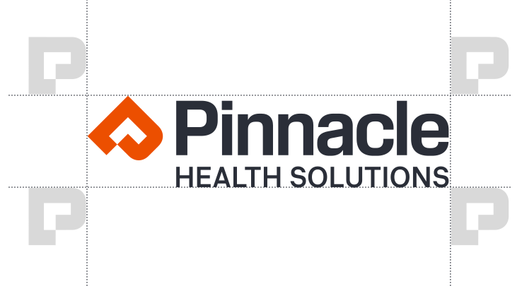
.tsm-19l9o1m{font-weight: 500}Incorrect Logo Use
In order to keep the Pinnacle brand consistent, please avoid these common mistakes when using the logo.
DO NOT rotate or distort the logo
DO NOT alter the color on the logo
DO NOT place the logo on a brightly colored or busy background
DO NOT add effects to the logo (e.g., drop shadow, glow, gradient)
